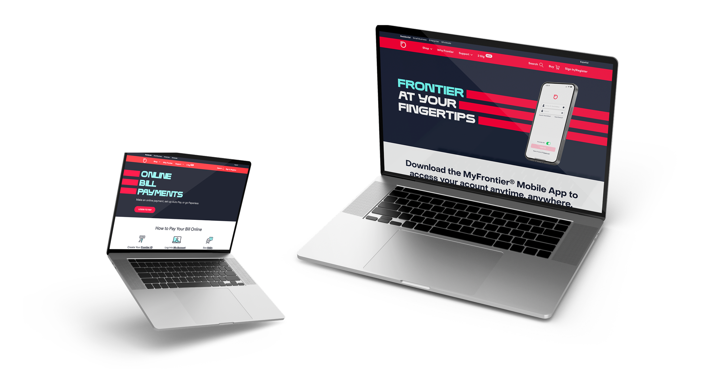
Through the years, Frontier has gone through a handful of redesigns, rebrands, overhauls, and content exploration. My job was to lead the UX and design efforts to adopt the new visual ID’s and make UX improvements to help with customer satisfaction scores, bill payments, app adoption, and improve the overall customer experience.
My Role: UX Leadership
Frontier Comminications
Online Bill Payments
Challenge:
Certain customers had a hard time paying their bill. Whether their account management portal was too confusing or they didn’t want to use an app, there was always a cross section of people that didn’t pay on time.
Solution:
The original page was poorly designed and executed and customers were having a hard time making a simple payment. We leaned into some user testing to get qualitative and quantitative data to show what was happening with the user flow. We reviewed the user feedback and performed UX testing to see what people found most useful. Taking those data, we did an overhaul and simplification of the Online payment page to help customers learn how to pay online and get it off of their minds.
Results:
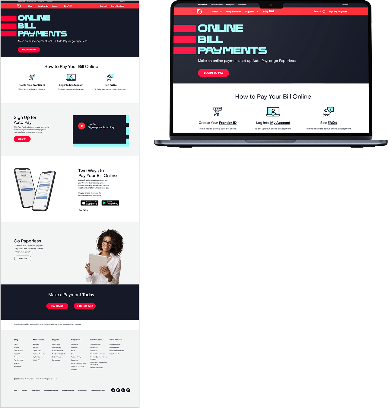
The results were a much more simplified and well designed page that ended up driving online payments up by 65%.
MyFrontier Mobile App
Challenge:
The old MyFrontier app was clunky. It was hard to navigate and almost impossible to find any information relating to a user account. For years, “improvements” were made using nothing but feeling and no data.
Solution:
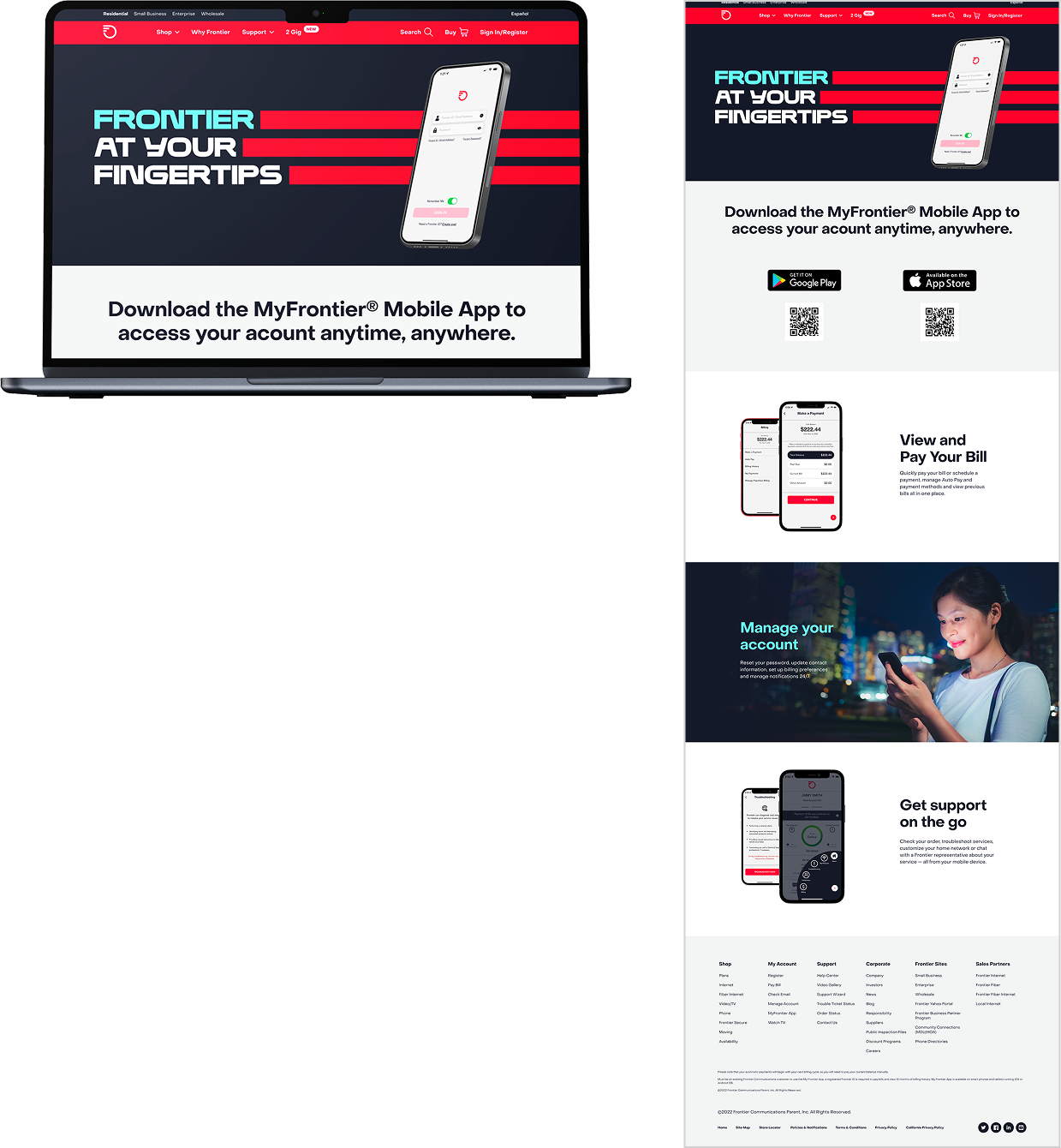
We wanted to showcase the new features on a simplified landing page. Customers had given feedback that the current landing page didn’t tell much about the benefits of the app, so we simplified the messaging and visuals to present a simple overview of the app.
Results:
Increase in app adoption, online bill payments, and calls to customer service went down with respect to questions about the app and the features. It also drove online bill payments up since it was easier to make payments without having to hunt for information or content.
Channel Updates
Challenge:
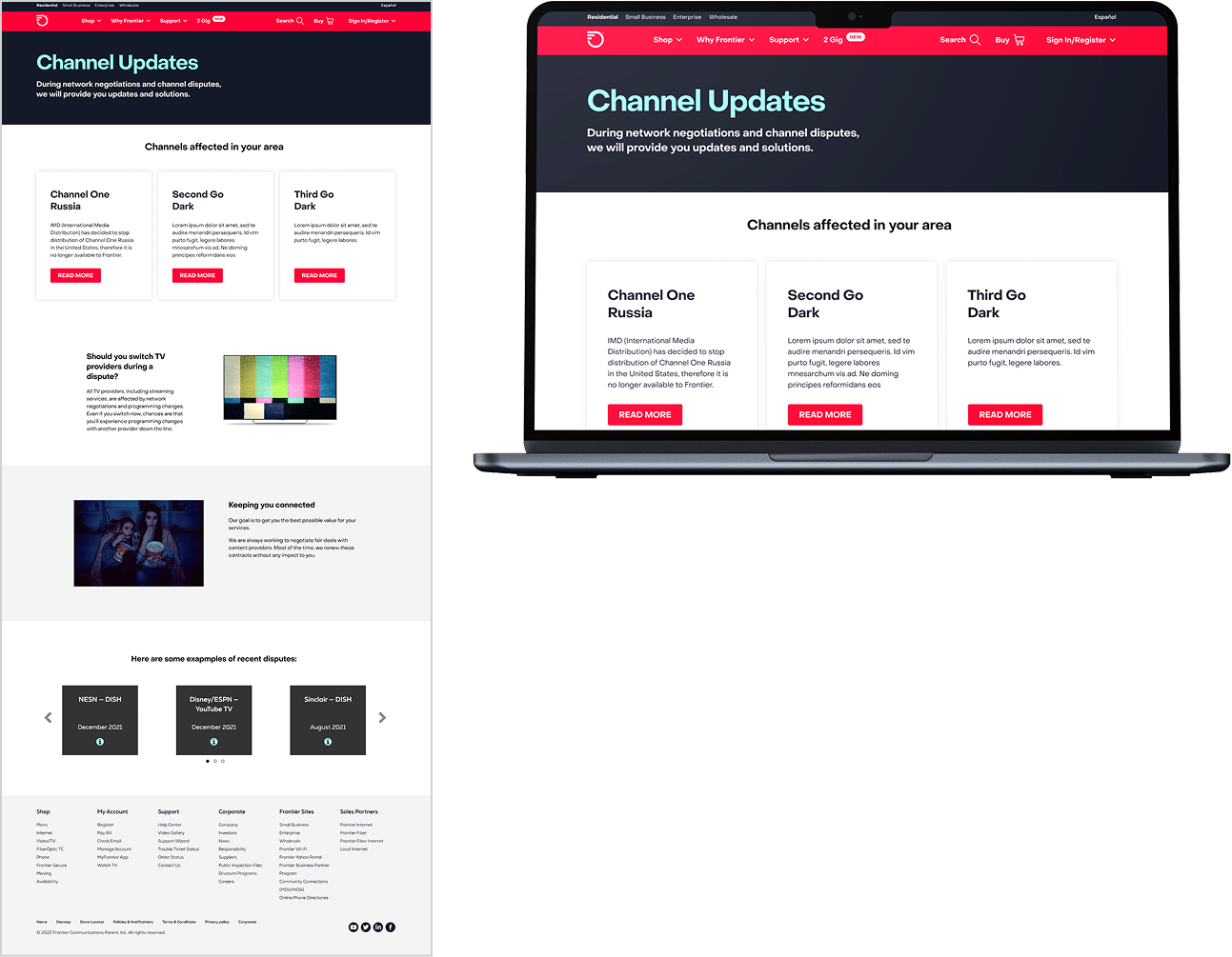
The original page was a full microsite with far too much copy and content. We found the users would abandon the page after only a few seconds. That lead us to the hypothesis that there was too much for the user to take in and this was confirmed by gathering quantitative data that showed us there was a high level of user frustration.
Solution:
The data we found gave us a clear understanding of the content users were and were not interacting with. We trimmed the content that wasn’t getting attention and had a copywriter update each page with a more detailed explanation of why a channel was going away and for how long.
Results:
The redesign and simplification to a singe page was found to have a far better impact on the user understanding of why they were losing channels. Bounce rates plummeted and time spent on page increased by 2–3 mins per page.